CarbonBetter
CarbonBetter’s identity was built around a simple idea: small actions can create meaningful change. Designed to meet clients wherever they are in their sustainability journey, the visual language balances optimism and approachability with a sense of progress.
At the center of the identity is the Multiplier, a symbol inspired by the scientific formula for carbon dioxide. Its geometric forms represent the progression from a single action to a larger collective impact, becoming the foundation for a flexible visual system.
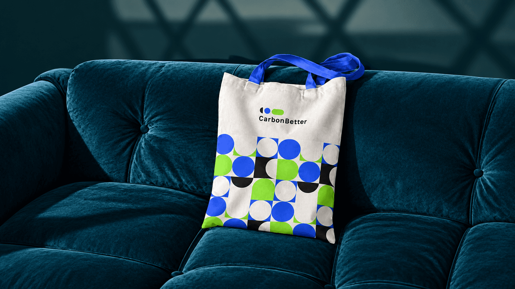
My role focused on developing the typography and pattern systems. The typography system brought together typefaces with distinct roles, creating a clear hierarchy while subtly referencing the identity through details like the circular construction of the primary typeface’s lowercase “r.” The symbol’s geometry was also extended into patterns and image treatments, creating a stronger connection across the identity. Together, typography, photography, pattern, and graphic elements created a flexible system that could extend across digital and physical applications.
Creative Director: Allie Fisher
Design Director: Margaret Swart
Art Director: Ensley Rivers
Designer: Magali Lebon


